DREAMLAMP
The preschool of your dreams where you will learn everyday life lessons
UX Project - Dreamlamp App
DREAMLAMP
The preschool of your dreams where you will learn everyday life lessons
UX Project - Dreamlamp App
DREAMLAMP
The preschool of your dreams where you will learn everyday life lessons
UX Project - Dreamlamp App
Role
Role
Role
UX Designer, UX Researcher
UX Designer, UX Researcher
Tools
Tools
Tools
Figma, FigJam, Google Suite, Adobe Illustrator
Figma, FigJam, Google Suite, Adobe Illustrator
Responsibilities
Responsibilities
Responsibilities
User Research, Identify Missing Flows,
Refining Design, Prototyping
User Research, Identify Missing Flows,
Refining Design, Prototyping
Team
Team
Team
1 Designer (Me), 1 Product Manager, 4 Engineers
1 Designer (Me), 1 Product Manager, 4 Engineers
Overview
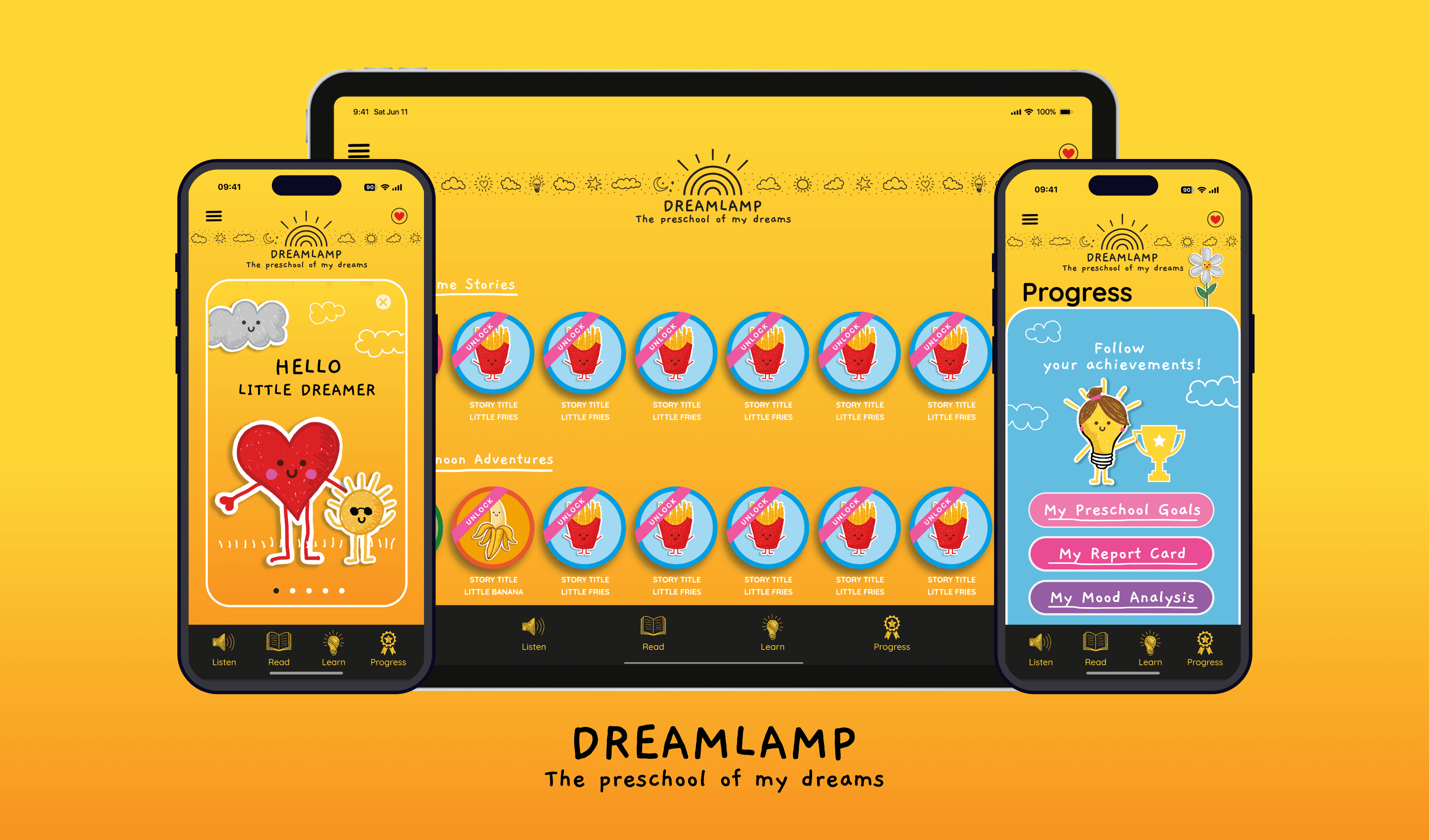
Dreamlamp is a learning app for toddlers and preschoolers. My responsibility was to complete the designs for the mobile and tablet experience. I had the assets and inspirational screens provided by the stakeholders. My primary task was to identify any gaps in user flows and complete the designs for all possible flows. We targeted two screens size mobile and tablet.
Dreamlamp is a learning app for toddlers and preschoolers. My responsibility was to complete the designs for the mobile and tablet experience. I had the assets and inspirational screens provided by the stakeholders. My primary task was to identify any gaps in user flows and complete the designs for all possible flows. We targeted two screens size mobile and tablet.
Challenge
The design inspirations I received were appealing but quite abstract. All the elements had fixed positions, which didn't align with functional design principles. My task was to take these inspirations and translate them into a cohesive app experience. I had to make sure that not only the experience is good but is also technically feasible.
Expanding the user experience from a mobile screen to a tablet. Utilizing the negative space on the tablet screen was a significant challenge.
The design inspirations I received were appealing but quite abstract. All the elements had fixed positions, which didn't align with functional design principles. My task was to take these inspirations and translate them into a cohesive app experience. I had to make sure that not only the experience is good but is also technically feasible. Expanding the user experience from a mobile screen to a tablet. Uzalitzing the negative space on the tablet screen was a significant challenge.
The design inspirations I received were appealing but quite abstract. All the elements had fixed positions, which didn't align with functional design principles. My task was to take these inspirations and translate them into a cohesive app experience. I had to make sure that not only the experience is good but is also technically feasible. Expanding the user experience from a mobile screen to a tablet. Uzalitzing the negative space on the tablet screen was a significant challenge.
Solution
Solution
Converting the design inspirations to functional designs through strategic refinement and prototyping.
Converting the design inspirations to functional designs through strategic refinement and prototyping.
Mobile & Tablet App
Mobile & Tablet App
Identify & design missing flows
Identify & design missing flows
Identify & design missing flows
Create & Implement layouts
Create & Implement layouts
Create & Implement layouts
Responsive designs
Responsive designs
Prototyping & Interaction design
Prototyping & Interaction design
Prototyping & Interaction design
My Approach
My Approach
I followed a lean approach to tackle the challenge. Starting with understanding the stakeholder's vision and ideas. Then, I crafted user flows to identify gaps in the current defined experience.
I conducted experiments to test and refine ideas. Created a layout system that facilitated design for different screen sizes.

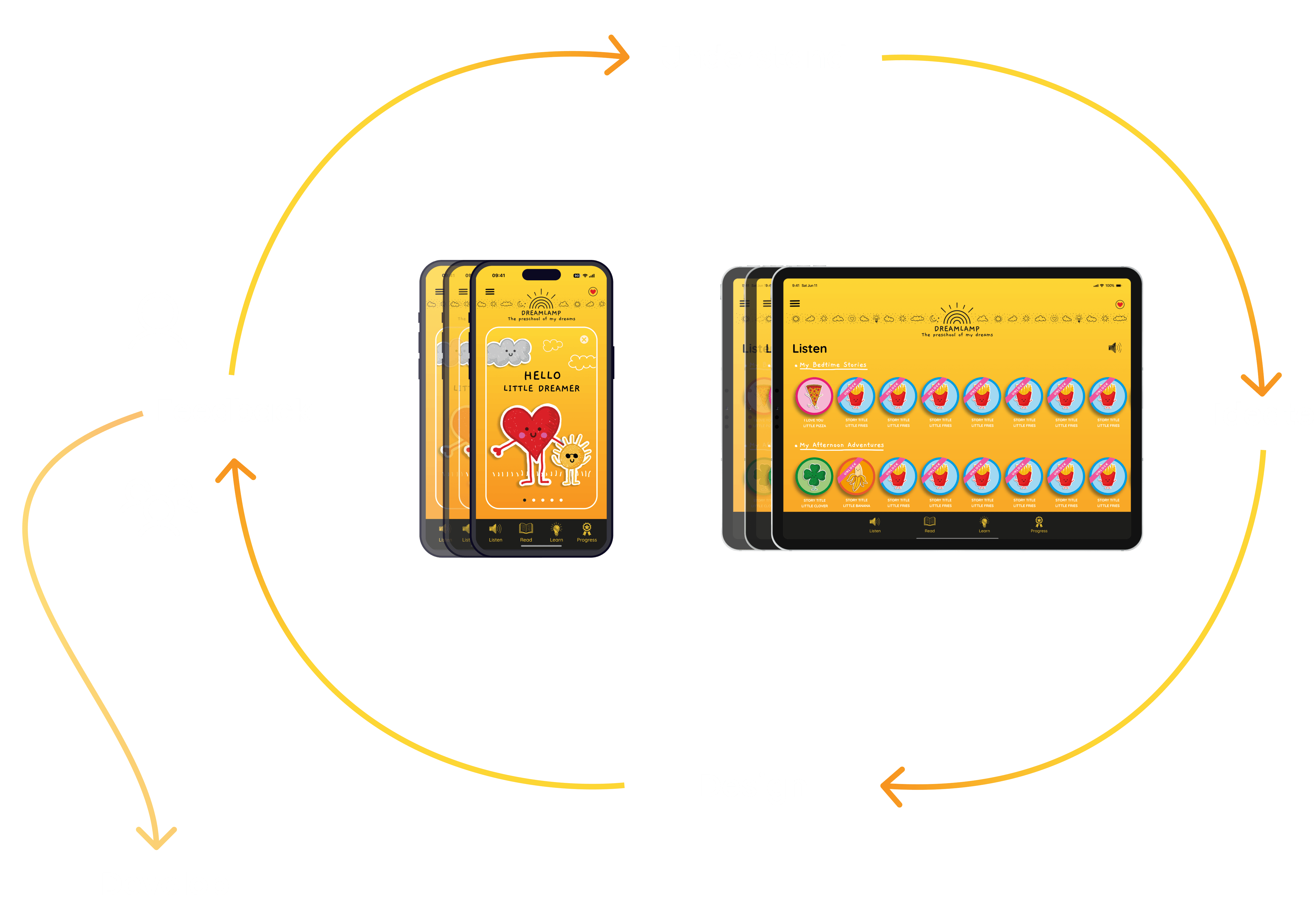
Experimenting with layouts
After identifying the gaps in the user flows. I started to experiment with layouts to organize screen content in different sizes.
On the mobile devices, we would have one column with all the content. In the tablet version, we would have multiple columns. So after much experimentation, I devised a way we keep the information in the center column. And transitioning from a single-column to a three-column layout system in tablet devices.
In the mobile app, I focused on a center column, housing interactive elements. On the tablet view, two side columns took place, one on the left and one on the right. They housed illustrations to optimize the negative space.
For complex components, I employed a scaling mechanism to ensure a consistent experience
Trifecta Layout - three column layout
The three-column layout adapted seamlessly to different device sizes, optimizing the user experience. On mobile devices, it presents a single-column arrangement with interactive elements in the center. When viewed on tablets, it dynamically transitions into a three-column structure, with two side columns featuring illustrations to enhance the use of negative space. Complex components are scaled to maintain a consistent and user-friendly interface.
The three-column layout adapted seamlessly to different device sizes, optimizing the user experience. On mobile devices, it presents a single-column arrangement with interactive elements in the center. When viewed on tablets, it dynamically transitions into a three-column structure, with two side columns featuring illustrations to enhance the use of negative space. Complex components are scaled to maintain a consistent and user-friendly interface.
Mobile Layout
The mobile version employs a streamlined single-column layout that prioritizes user interaction in the central space. This design approach ensures a friendly and engaging mobile experience, optimizing accessibility and ease of use.
The mobile version employs a streamlined single-column layout that prioritizes user interaction in the central space. This design approach ensures a friendly and engaging mobile experience, optimizing accessibility and ease of use.
Tablet Layout
In the tablet version, a sophisticated three-column layout gracefully unfolds. Two side columns artfully showcase illustrations, effectively utilizing negative space to enhance aesthetics. This thoughtful design adaptation for tablets provides a visually appealing and immersive user experience, elevating the overall tablet interface.
In the tablet version, a sophisticated three-column layout gracefully unfolds. Two side columns artfully showcase illustrations, effectively utilizing negative space to enhance aesthetics. This thoughtful design adaptation for tablets provides a visually appealing and immersive user experience, elevating the overall tablet interface.
Results
To overcome the challenge of expanding the user experience for different screen sizes. I devised a 3-column layout system.
The approach began with a single column on mobile and expanded to three columns on tablets. The system enabled the development team to display columns based on the device type.
The smooth appearance of columns in the tablet version provided a seamless experience. It was not only appealing but also made sense. The use of different illustrations added more to the tablet experience aesthetics.


Learnings
Dreamlamp provided me with an opportunity to see how functional design works. And aesthetics while important are not always technically feasible. Also helped me to understand that we need to involve the development team in the early phases of ideation.
Dreamlamp provided me with an opportunity to see how functional design works. And aesthetics while important are not always technically feasible. Also helped me to understand that we need to involve the development team in the early phases of ideation.
Understanding more about functional designs.
Value of considering engineering perspective early in designs.
Advanced component design and use of auto layout for improved design efficiency.
Learning new interaction details, enhancing Figma prototyping skills.
Understanding more about functional designs.
Value of considering engineering perspective early in designs.
Advanced component design and use of auto layout for improved design efficiency.
Learning new interaction details, enhancing Figma prototyping skills.
THE END
Thankyou 🙏🏻
I appreciate your time and attention, I hope you have liked the work. Want to share your thoughts?
I appreciate your time and attention, I hope you have liked the work.
Want to share your thoughts?
I appreciate your time and attention, I hope you have liked the work. Want to share your thoughts?


